
Your website could be blocking millions of users right now due to ARIA accessibility. Here’s how to fix it.
Did you know that over 1 billion people worldwide live with disabilities?
Yet, most websites remain inaccessible to them.
This isn’t just a moral issue. It’s a business problem.
Inaccessible websites lose customers. They face lawsuits. They miss opportunities.
But here’s the thing: making your website accessible doesn’t have to be complicated.
ARIA accessibility is your secret weapon.
My Wake-Up Call with ARIA Accessibility
Three years ago, I watched my friend Sarah struggle to buy concert tickets online.
She’s blind. Uses a screen reader.
The “Buy Now” button? Just said “Click here.”
The seat selection? A meaningless grid of divs.
She gave up after 20 minutes.
That’s when it hit me: We’re not just excluding users. We’re excluding customers, friends, family members.

The Numbers Don’t Lie
- 15% of the global population lives with disabilities
- 96.3% of homepages have accessibility failures (WebAIM study)
- $13 billion lost annually due to inaccessible websites
- Over 4000 accessibility lawsuits filed in 2024 alone
What Is ARIA Accessibility? (And Why It Matters More Than You Think)
ARIA stands for Accessible Rich Internet Applications.
Think of ARIA accessibility as a translator. It takes your complex web components and explains them to assistive technologies like screen readers.
Without ARIA accessibility, your dropdown menu is just a bunch of divs. Your image carousel? A meaningless pile of code.
With proper ARIA accessibility implementation, these become navigable, understandable interfaces.
The brutal truth? Most websites fail basic accessibility tests. Don’t let yours be one of them.
The Real Cost of Ignoring ARIA Accessibility
Here’s what happens when you skip ARIA accessibility:
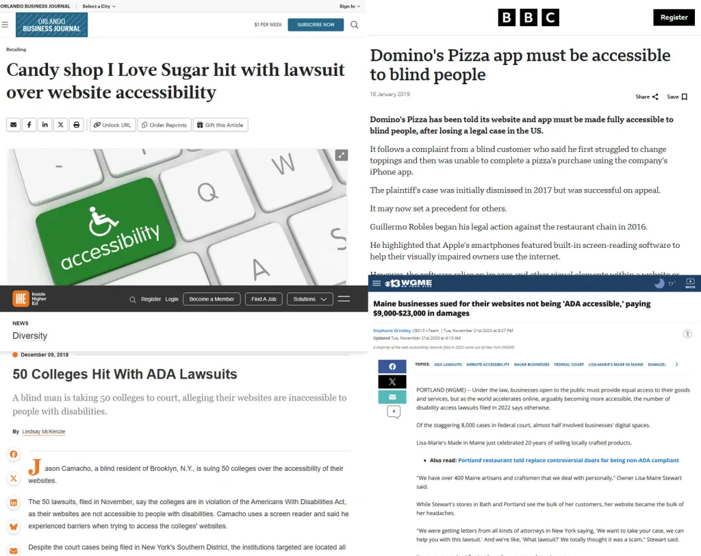
Legal risks. Companies like Target, Netflix, and Domino’s have faced lawsuits. Millions in settlements.
Lost revenue. The disability market represents $13 trillion in annual disposable income globally.
SEO penalties. Google considers accessibility a ranking factor. Poor accessibility = poor rankings.
Brand damage. Social media doesn’t forgive accessibility failures.
Real Companies, Real Consequences
Target Corporation: $6 million settlement in 2006. Still fighting accessibility lawsuits today.
Domino’s Pizza: Supreme Court case. Spent more on legal fees than fixing their website would have cost.
Netflix: $755,000 settlement for inadequate closed captions.
Beyoncé’s Website: Sued for accessibility violations. Even celebrities aren’t immune.
ARIA Accessibility Fundamentals Every Developer Must Know
The Three Pillars of ARIA Accessibility
1. Roles Tell assistive technologies what an element is.
2. Properties Describe the element’s current state.
3. States Explain what’s happening to the element.
Master these three concepts, and you’ll understand 90% of ARIA accessibility implementation.
How I Test ARIA in 5 Minutes
Here’s my quick accessibility audit process:
- Step 1: Turn off your monitor. Navigate with Tab key only.
- Step 2: Use a screen reader (NVDA is free for Windows).
- Step 3: Check color contrast with WebAIM’s tool.
- Step 4: Validate with axe DevTools.
- Step 5: Test on mobile with voice control.
Can’t complete these steps? Your site fails accessibility.
ARIA Roles Cheat Sheet
1. Landmark Roles (Page Structure)
| Role | What It Does | When To Use | Example |
|---|---|---|---|
| banner | Site-wide header | Once per page, top header |
|
| navigation | Navigation menus | For main or secondary navigation | |
| main | Main content area | Once per page |
|
| complementary | Related content sidebar | Sidebars, secondary content | |
| contentinfo | Site-wide footer |
Footer section |
|
| search | Search region | Dedicated search forms | |
| region | Generic landmark region |
Any important section with label |
|
| form | Grouping form controls |
Forms |
|
2. Widget Roles (User Interface Controls)
| Role | What It Does | When To Use | Example |
|---|---|---|---|
| button | Clickable button | Buttons or links acting as buttons |
|
| checkbox | Checkable box |
Checkboxes | |
| radio | Radio button |
Radio buttons |
|
| radiogroup | Group of radio buttons |
Group |
|
| combobox | Dropdown with search/filter |
Dropdowns |
|
| listbox | List of selectable options |
Select lists |
|
| option | Option in a listbox |
Items in listbox |
|
| slider | Adjustable slider |
Sliders | |
| spinbutton | Numeric input with increment/decrement |
Numeric inputs |
|
| textbox | Text input |
Text fields |
|
| searchbox | Search input |
Search fields |
|
| menu | Menu container |
Menus |
|
| menubar | Menu bar |
Menu bars |
|
| menuitem | Item in a menu |
Menu items |
|
| menuitemcheckbox | Checkable menu item |
Checkable menu items |
|
| menuitemradio |
Radio menu item |
Radio menu items |
|
| tab | Tab in tablist |
Tabs | |
| tablist | Container for tabs |
Tabs container |
|
| tabpanel | Tab panel |
Panels controlled by tabs |
|
| tooltip | Tooltip information |
Tooltips |
|
| scrollbar | Scrollbar control |
Custom scrollbars |
|
3. Document Structure Roles
| Role | What It Does | When To Use | Example | |
|---|---|---|---|---|
| article | Self-contained content |
Articles, blog posts, comments |
|
|
| section | Thematic grouping of content |
Sections within pages |
|
|
| heading | Section heading |
Headings with levels |
|
|
| list | List of items |
Lists |
|
|
| listitem | Item in a list |
List items |
||
| row | Row in a grid or table |
Table rows |
|
|
| rowgroup | Group of rows |
Table body or header groups |
... |
|
| columnheader | Column header |
Table column headers |
|
|
| rowheader | Row header |
Table row headers |
|
|
| table | Table container |
Tables | ||
| grid | Grid or spreadsheet |
Complex tabular data |
||
| gridcell | Cell in grid |
Grid cells |
|
|
| tree | Tree widget |
Trees |
|
|
| treeitem | Item in tree |
Tree nodes |
||
| treegrid | Tree with grid structure |
Complex trees |
||
| aria-level |
Work like h1, h2 etc tag |
If you not use like h1,h2 etc tags then you can declear using aria-level, browser will understand its heading tag. aria-level-1 to aria-level-6 same as h1 to h6 |
4. Live Regions and Status
| Role | What It Does |
When To Use |
Example |
|---|---|---|---|
| alert | Important, usually time-sensitive info |
For error messages and alerts |
|
| alertdialog | Modal alert requiring interaction |
Critical dialogs needing immediate attention |
|
| log | Live region with log updates |
For live logs |
|
| marquee | Scrolling text live region |
Scrolling news or info |
|
| status | Status messages |
Informational live updates |
|
| timer | Time-related live region |
Countdown timers |
|
5. Miscellaneous Roles
| Role | What It Does |
When To Use |
Example |
|---|---|---|---|
| application | Complex web application |
Rare, for apps with custom keyboard interactions |
|
| group | Grouping related elements |
Group form fields or controls |
|
| note | Advisory or supplementary info |
Side notes or tips |
|
| presentation | Layout or decoration only |
Elements ignored by assistive tech |
|
| separator | Divider between sections |
Dividers in menus/toolbars |
|
ARIA Attributes Cheat Sheet
1. Naming and Labeling Attributes
| Attribute | Purpose | Example |
|---|---|---|
| aria-label |
Provides an accessible name (text label) |
|
| aria-labelledby |
References one or more elements that label this |
|
| aria-describedby |
References element(s) that describe this element |
|
| aria-valuetext |
Overrides the text representation of a value |
|
2. State and Property Attributes
| Attribute | Purpose | Values / Usage Examples |
|---|---|---|
| aria-hidden |
Hides element from assistive tech |
“true” or “false” |
| aria-disabled |
Indicates element is disabled |
“true” or “false” |
| aria-checked |
Check state for checkbox, radio, or menuitemcheckbox |
“true”, “false”, or “mixed” |
| aria-selected |
Indicates selection in list, grid, tablist, etc. |
“true” or “false” |
| aria-expanded |
Shows if expandable element is expanded |
“true” or “false” |
| aria-pressed |
Toggle button pressed state |
“true”, “false”, or “mixed” |
| aria-required |
Marks input as required |
“true” or “false” |
| aria-readonly |
Element is read-only |
“true” or “false” |
| aria-busy |
Indicates loading or updating content |
“true” or “false” |
3. Relationships and Ownership Attributes
| Attribute | Purpose | Example |
|---|---|---|
| aria-controls |
Identifies element(s) controlled by this element |
|
| aria-owns |
Creates a parent/child relationship not in DOM |
|
| aria-activedescendant |
Identifies currently active child element |
|
| aria-flowto |
Indicates next element in reading order |
|
4. Live Region Attributes
| Attribute | Purpose | Values / Usage Examples |
|---|---|---|
| aria-live |
Announces dynamic updates to assistive tech |
“off”, “polite”, “assertive” |
| aria-atomic |
Whether updates are presented as a whole or partial |
“true” or “false” |
| aria-relevant |
What types of changes are relevant for announcements |
“additions”, “removals”, “text” |
5. Widget-Specific Attributes
| Attribute | Purpose | Example / Values |
|||||||||||||||||||||||||||||||||||||||||||||||||||||||||||||
|---|---|---|---|---|---|---|---|---|---|---|---|---|---|---|---|---|---|---|---|---|---|---|---|---|---|---|---|---|---|---|---|---|---|---|---|---|---|---|---|---|---|---|---|---|---|---|---|---|---|---|---|---|---|---|---|---|---|---|---|---|---|---|---|
| aria-valuenow |
Current value for slider, spinbutton, progressbar |
|
|||||||||||||||||||||||||||||||||||||||||||||||||||||||||||||
| aria-valuemin |
Minimum value |
|
|||||||||||||||||||||||||||||||||||||||||||||||||||||||||||||
| aria-valuemax |
Maximum value |
|
|||||||||||||||||||||||||||||||||||||||||||||||||||||||||||||
| aria-colcount |
Number of columns in a grid or table |
|


